The semi-rebrand of Zapier
When I joined Zapier back in 2017, my first project seemed pretty straightforward: redesign an illustration for our Teams plan. A year or so later, that innocuous graphic resulted in a ripple effect that touched on not only our design system, but also our brand identity. But before we get to all of that, let’s start with a little bit of Zapier’s design history:
Superheroes, Robots, and Rockets - oh my!
Way back in 2011 when Zapier ‘twas but a small startup, the founders (Bryan, Wade and Mike) received feedback from an early adopter that jump started their design direction: the simple act of connecting apps together (e.g. basically how Zapier works) was akin to “being granted super powers.” Inspired, the design team used 1950s-era comic book art, like Jack Kirby, throughout the site:
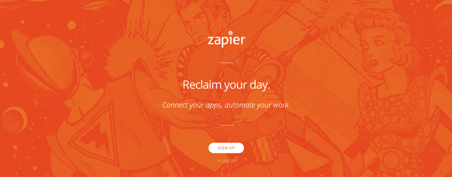
As our user base grew and our product added more complexity (like connecting more than one app together), the comic book art wasn’t fully communicating what our product did best: letting computers do the hard work for you. So, the design team iterated on some new concepts and landed on using robots and rockets (because of their connection to repetition (what computers love) and speed).

While these new elements helped explain our product, the design team was starting to notice that our brand was feeling incoherent. At this point in the timeline, our design team had grown to 5 product designers, who’s work touched on a diverse array of patterns, pages and elements. So to assess the current state of design at Zapier, they had a wonderful idea: an internal survey for all employees to share how they felt about our design direction. Dubbed the Design Listening Tour, the results were validating:
One of the largest themes we uncovered was around the lack of consistency of the Zapier brand. From superheroes to rocket ships, there was no clear rationale behind the Zapier visual identity. This caused confusion not only for our growing Design Team on how best to create cohesive user experiences together, but also for new users who were unfamiliar with Zapier. With each Product Designer embedded on different parts of the product, creating a map for them to work from was a crucial step towards solving that problem.
👆🏼 Zapier’s Remote Design blog post
Galvanized, the design team got together with Marketing to create a list of brand words, or “pillars” that would serve as the foundation to build from. Here’s what they came up with:
- Open
- Reliable
- Simple
- Approachable
The next step in this process - and right when I joined the conversation - was to create a semi-overwhelming competitive analysis of our brand, to determine where we fit in the landscape, and how our newly-formed pillars would reflect against the landscape. We learned:
through our design elements and communication style, [our brand] offers a playfulness and friendliness that stands out compared to several other brands. We decided to take these findings as an opportunity to explore ways to amplify this feeling of delight and evolve our visual identity. -https://zapier.com/blog/remote-design-visual-identity/
Sharing is caring
Now that we have some more context, let’s talk about Zapier for Teams. At the time, our plan was about to get a major upgrade: sharing Zaps (the basic building block of our product). This was a big deal. It meant that anyone on a Teams plan could create something and share it with all the information intact. No need to reconnect auths, or re-enter information for complicated steps. It was fast, simple and reliable.
So to let our users know this was happening, we set out to redesign the marketing page. One of the key deliverables on this project was driving home how important sharing was and the idea was to do that by rethinking this current graphic, which represented Teams:

Process
Before joining Zapier, I spent the better part of 14 years working on various branding projects. As my work transitioned into web design, I started to focus on iconography and so-called “spot” illustrations that communicated complicated ideas. When I started this project, I leaned on my process and started jotting down questions I wanted to answer. Like:
- How do you communicate "sharing" without requiring the audience to know what a Zap is?
- Who is doing the "sharing" and do we see "them"?
- Can we make our product a little more warm or friendly?
To start, I iterated on our interface elements to make them abstract and uses an invisible force to do the actions:
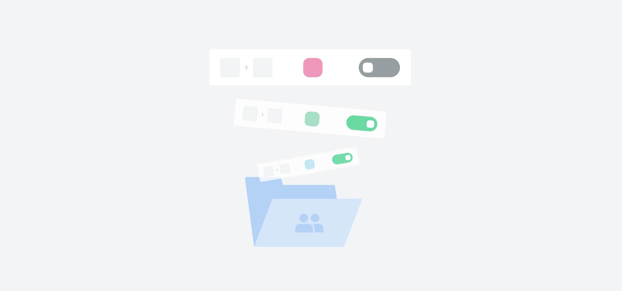
But this approach was too abstract. Our UI didn’t read and it wasn’t clear what the action was. It looked more like saving than sharing. Looking back, I think I was trying to avoid coming up with people as to avoid the slippery slope of abstracting gender, sex, race, etc.
My next idea came in form of hands. Hands are, of course, distinctly human and I liked the idea of having a juxtaposition of something exact and computer-created (e.g. our UI) and the organic, maybe uneven look of hands. It was more clear that something was being shared by people but it wouldn’t require seeing an entire person, which also could impact creation time. Here are some early iterations on that idea:
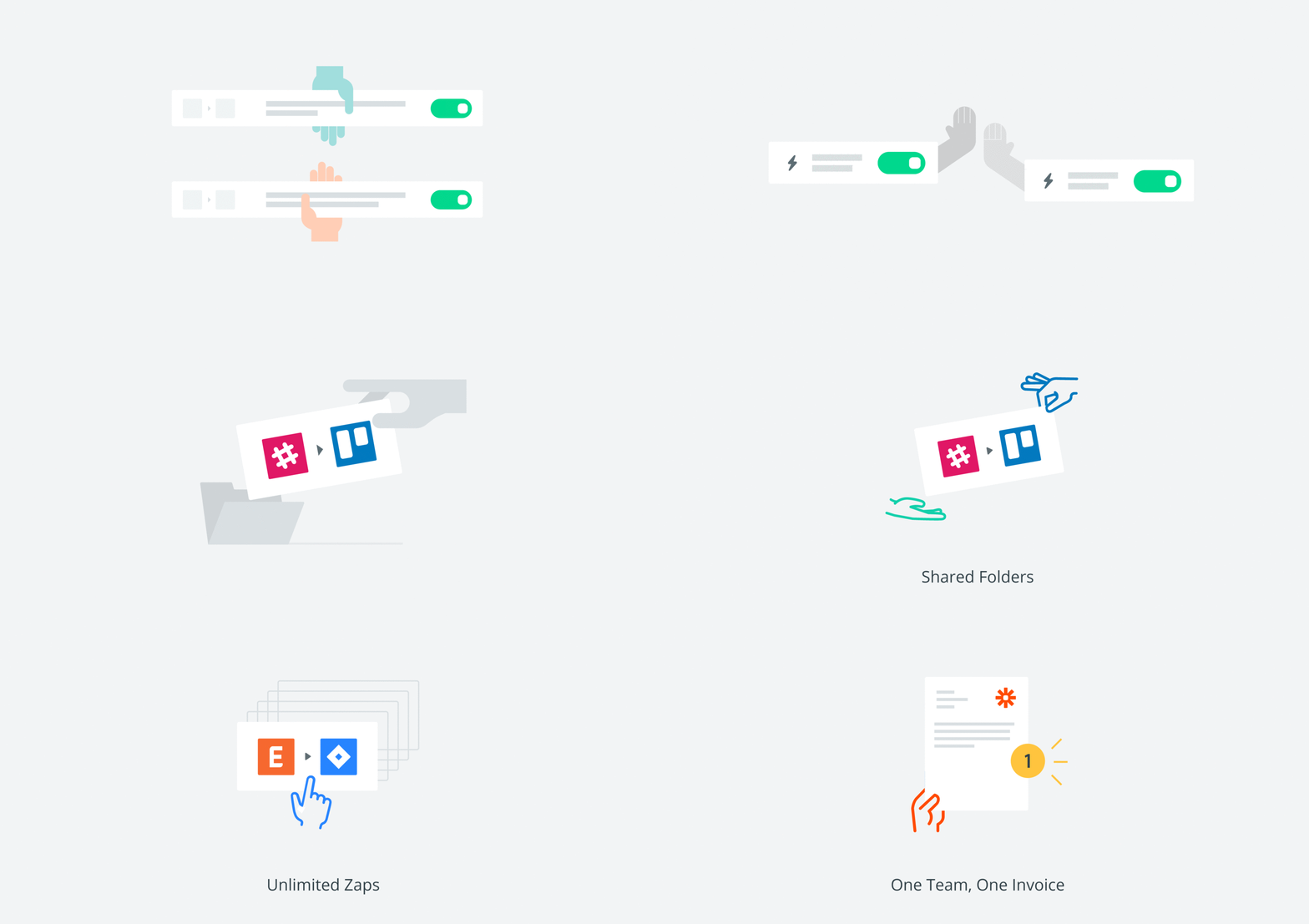
This concept started to feel like the right direction. It wasn’t perfect, but it was moving the needle towards where I thought we should go. I started to noodle on communicating other features of the Teams launch, like security or paying per team member. But this exploration revealed that having hands in every “scene” felt forced. Using hands also meant that you would have to create a rule for when to use them and when not to, which is convoluted if it were to be added to a shared design system.
And now, Zaplings
During my in-person onboarding retreat, Wade (one of the founders) mentioned a few anecdotal pieces of feedback from early testers. In fact, it was the same group of testers who gave us the comic book art idea. One piece of feedback that stood out was the feeling that using Zapier was like having a rabble of little entities working behind the scenes to automate your work.
The whole idea sounded kind of magical, like something you’d see in a children’s book. Or like how in the movie Toy Story, Woody and Buzz spring to life when no one is around. I started to wonder: could I anthropomorphize our interface elements to make them relatable and human? Could it be as simple as putting little arms and legs on them to communicate everything that our product does for you? Inspired, I grabbed my sketchbook:
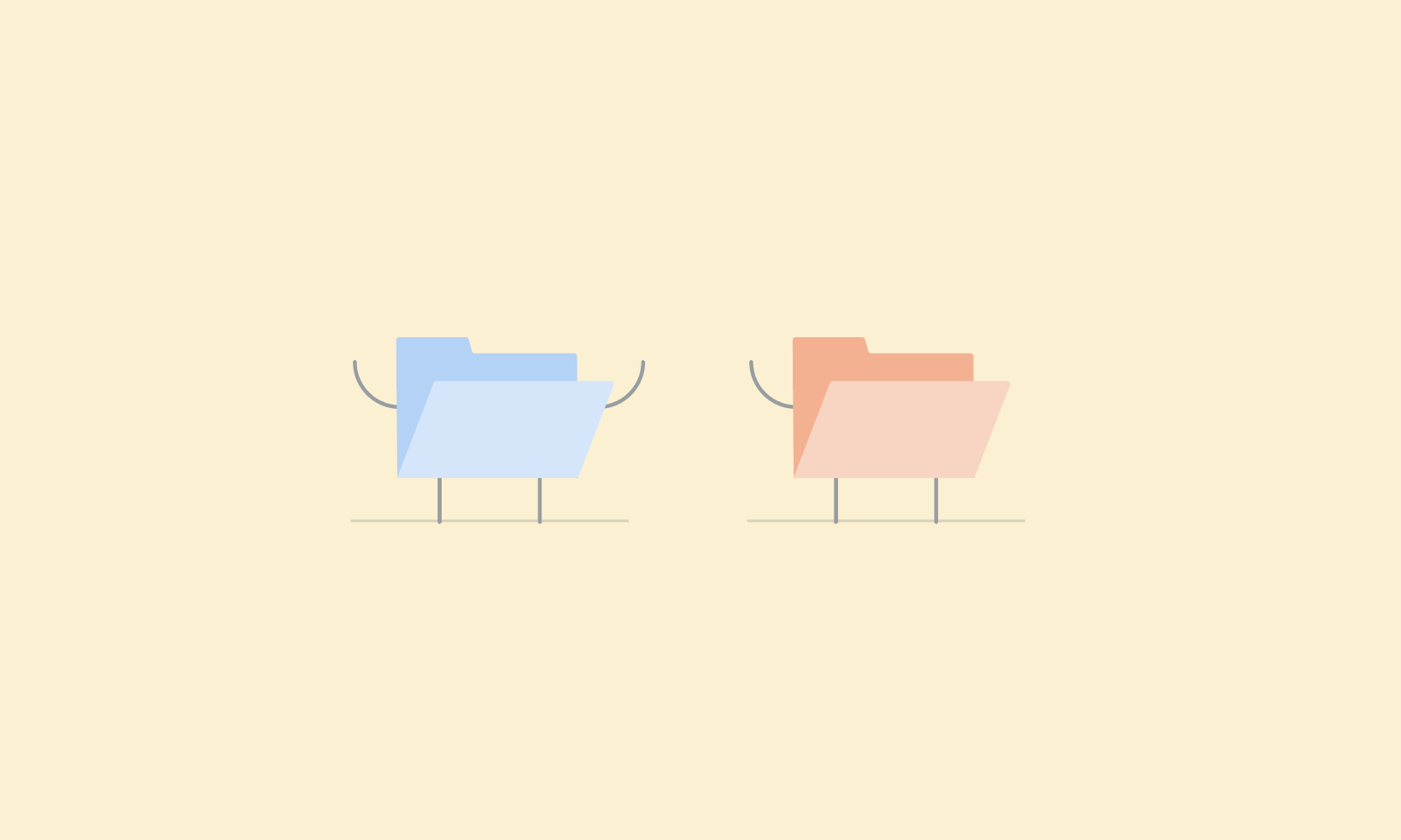
There was something about this concept that felt a little bit quirky, but also nuanced and endearing. I started iterating on the concept by building out a “character” from all sides, as if I was going to create a physical version of it:
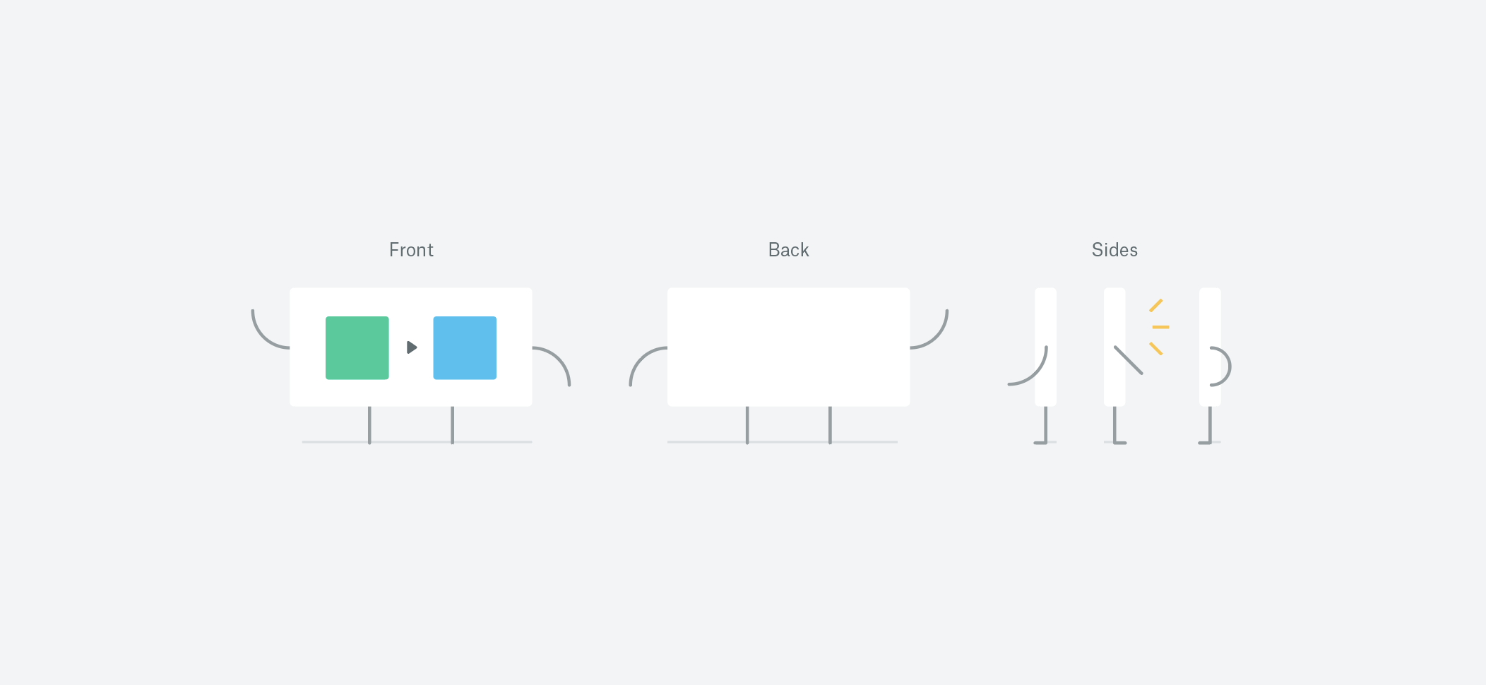
I started to imagine these little folks walking around, clocking into work with an old-school punch clock and sitting down for coffee. They were there, invisible, working in the background just like that early adopter mentioned, connecting apps together and running actions. It was silly, in a way, but it worked. Best of all, this illustration direction was easy to replicate across the entire design team. With a little bit of guidance, pretty much anyone could - and does - create them.
Animation and beyond
After completing the illustrations for the Teams, I looped in another designer, Evan, to talk about animation. I thought a way we could level up these concept was to give them movement. I storyboarded the ideas and he created GIFs for the site.

These little folders were so stoked about sharing that they celebrated with the high five. I was smitten. From there, we collaborated on 6 more illustrations that turned into animations for the final product:

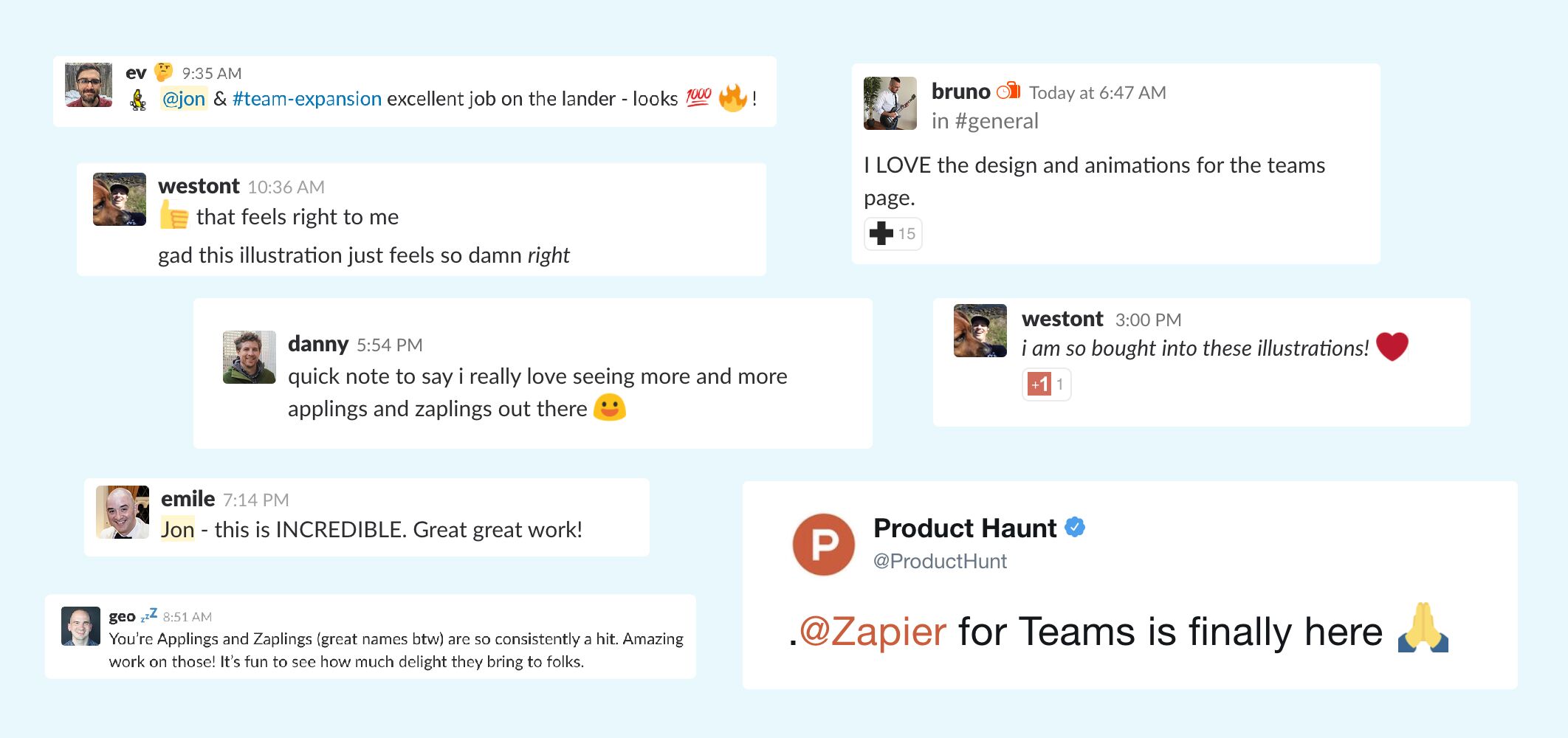
After the launch, that could have been the end of it. Neat illustrations that the Team loved and communicated our features. But shortly there after, other folks around the company were asking about them and praising them for being approachable and funny:
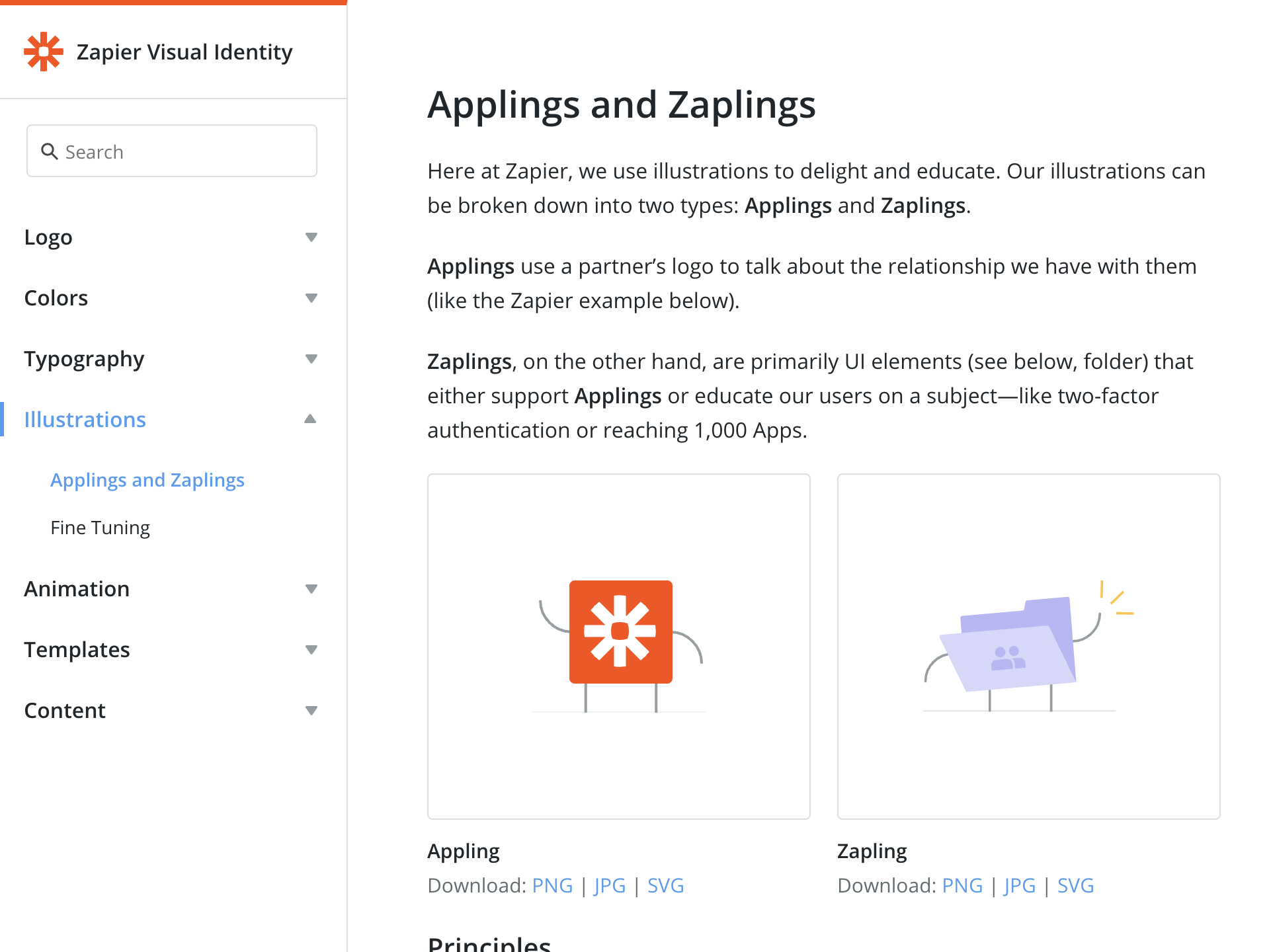
Before long, other teams were asking for illustrations of their own. Having had the experience of building illustrations systems for other clients, I set out to create a style guide of how to use (and not use) them as a part of our visual guidelines:
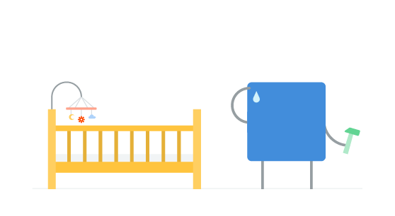
Heck, some teammates were even asking for the artwork for non-work related projects, like baby announcements:
In the end, I’m grateful for the resounding buy-in from not only my Team but the company as well. The illustrations have had a profound impact on how our users perceive Zapier beyond what I could have imagined. Thanks for reading!